
Analysis and visualization of transport data


In this post, we will discuss various methods for analyzing and visualizing GPS data within a collaborative project between RISE, MobiOne and the municipality of Helsingborg. MobiOne provided a dataset containing over 5.3 million GPS records for 11 trucks operated by three distinct groups. Our analysis focused on identifying delivery trends, such as identifying hot spot areas and stop points. Additionally, we calculated environmental impacts, including mileage, gas emissions, particle pollution, and more, which we visualized using grid-heatmaps.
We will explore graphical methods for creating heatmaps, trajectory maps, and grid-heatmaps to represent the environmental impact. You can find relevant links in the reference.
MobiOne helps transport companies to plan vehicle routes and to use the fleet vehicle more efficiently. Customers can see where a vehicle is in real-time and then follow up its route, stop times and the mileage.
Hot spot heatmap
HvPlot
Hvplot is an open-source high-level API for data exploration and visualization. Using Hvplot we can count the number of collected GPS-points at each location and visualize the intensity with heatmaps. On the heatmap, we can zoom in to see the details on the street level and zoom out to see the larger picture.
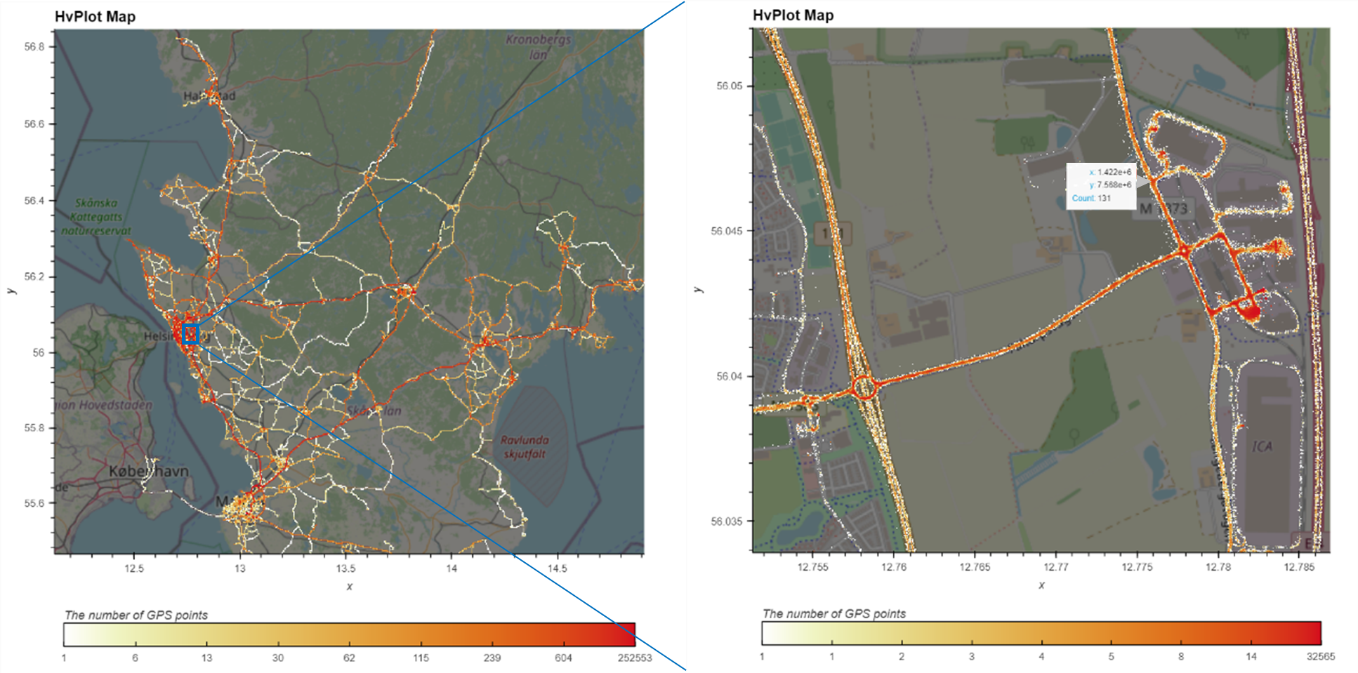
The colors on the maps show the number of GPS-points. The more reddish the color the more GPS-points has been collected at a specific location. This HvPlot map displays pop-up information, including x/y labels and count numbers by cursor.
Folium
Folium is an open-source Python library that specializes in geospatial visualization. In this post we are suggesting two methods for utilizing Folium to extract insights from geospatial data. One of these methods involves creating a heatmap.
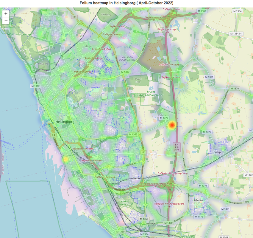
The color shows the intensity of the number of GPS points. The more reddish the color the more GPS-points has been collected at a specific location. The radius option was set to 15 pixels for the heatmap points, and when the map is zoomed in or out, the radius scales accordingly.
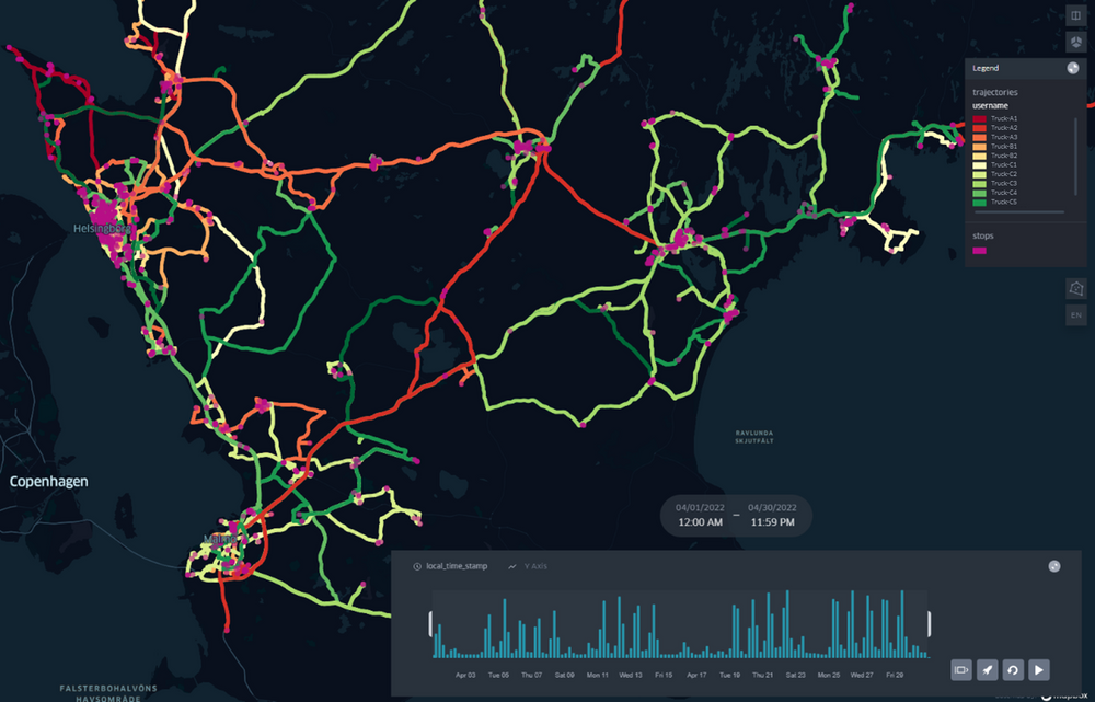
Stop detection and tracking animation
MovingPandas
MovingPandas is a Python library for handling movement data based on Pandas, GeoPandas, and HoloViz. In our analysis, we utilized MovingPandas, GeoPandas, and KeplerGl to identify stop points and create spatio-temporal visualizations.
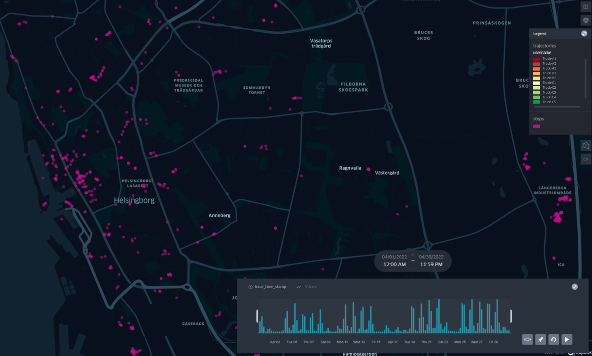
This map shows the detection of stop points for each delivery. We defined a stop point as a location where a vehicle’s duration within a 100-meter diameter exceeds longer than 5 minutes.
This map presents a trajectory map that includes these stop points, and it allows users to play the data as a map animation. Using this map, we can compare overlapping stop points among the trucks within the same time period for higher efficiency.
Environmental impact
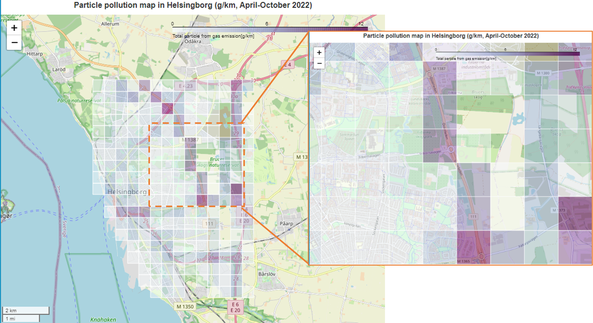
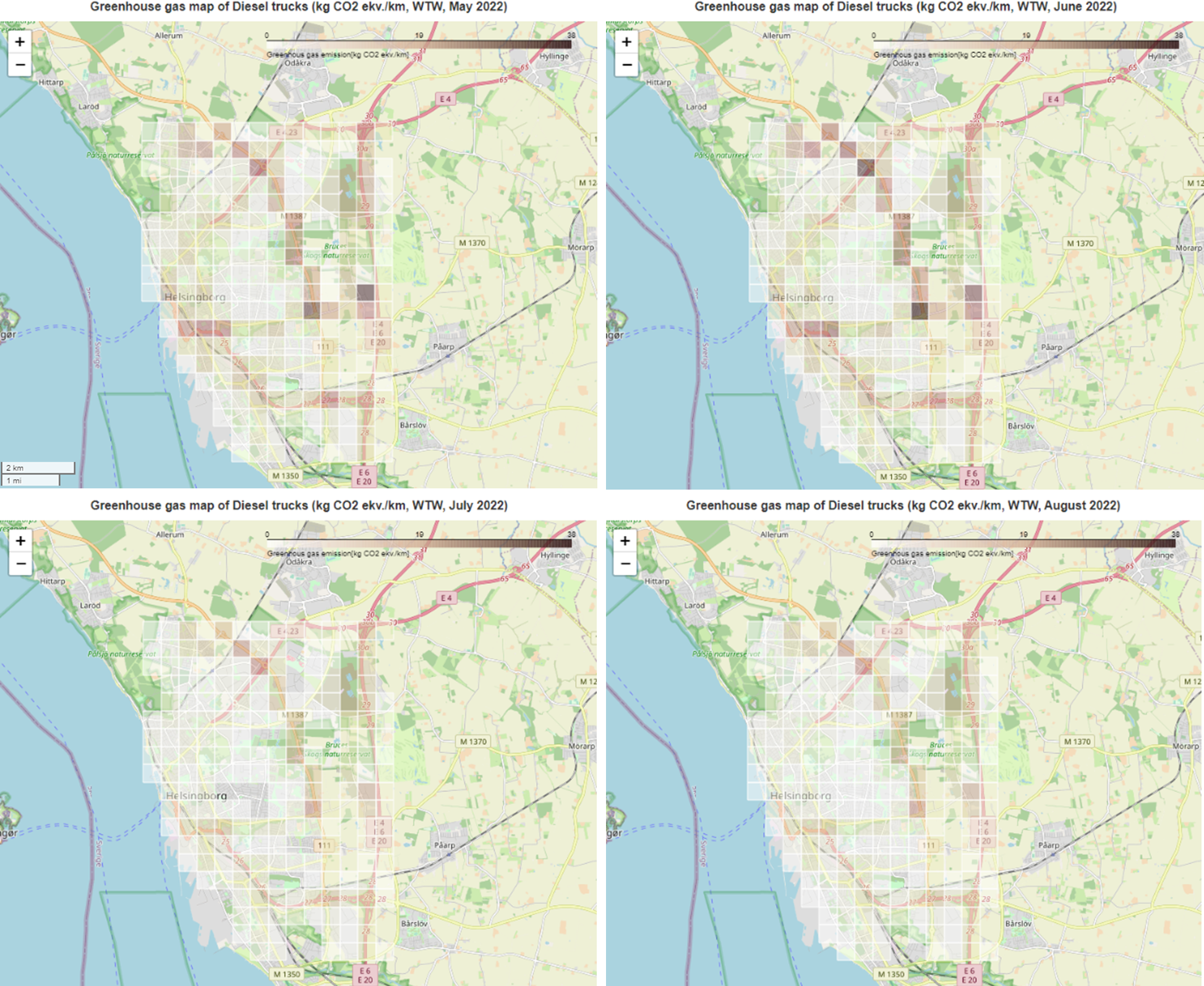
The GPS data were recorded by 11 trucks for 7 months, and we calculated total mileage. Using this mileage data, we visualized potential environmental impacts, including greenhouse gas emissions, particle pollution. Moreover, we can check monthly change in gas emissions, and compare emissions between diesel and electric trucks.
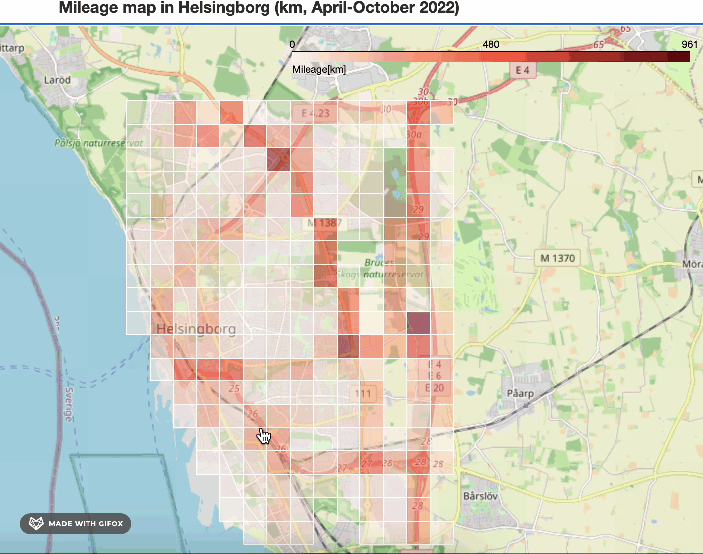
We created a grid heatmap, with each grid measuring 500 square meters. Using this mileage map, we generated other maps that consider environmental impact such as particle pollution, Greenhouse gas emission. Furthermore, we illustrated extra maps assuming electric vehicles to compare the impacts between gasoline and electricity. Those relevant environmental impact maps were generated by applying appropriate constants through multiplication.
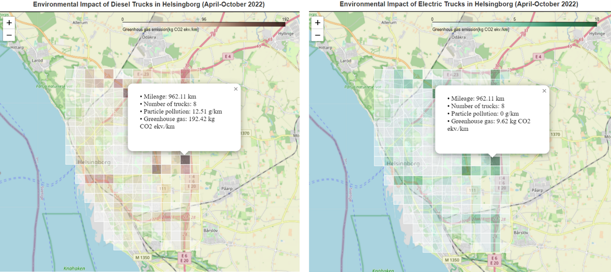
These two maps above show two different gas emission maps, one illustrating potential emissions for diesel trucks, and the other from what if the trucks are electric. This map offers an interactive feature with pop-up option. Clicking on a grid provides information, including the mileage covered in that area, the number of trucks that traversed it, levels of particle pollution, and greenhouse gas emissions.
In this post we have shown collaboration between RISE, MobiOne, and the municipality of Helsingborg. We explore three different python tools for analysis of GPS data: Folium, HvPlot and MovingPandas. We use these tools for data analysis and provide heatmaps that highlight popular routes and hot spots in the city of Helsingborg. Furthermore, we use the tools to identify stop points where trucks stop for a longer period of time. The stop points can be used to identify locations where several trucks often stop close in time. This in turn might be the basis for planning of possible transport hubs where reloading of goods can be done. Finally, we show that combining GPS-data with simple emission models and visualization tools can provide a basic overview of emissions and the environmental impact from trucks and the transport services. Heatmaps highlight how the emissions differ between different parts of the city. Heatmaps can also be used to show how the emissions evolve over time. The combination of collected GPS data and emission models can also provide a simplified what-if-analysis of the emissions, and on heatmaps we can illustrate how the emissions would be different if we have electric trucks instead of diesel or petrol trucks.
Reference
a. Will Norris, Aug 23 2022, Plotting Heat Maps in Python using Bokeh, Folium, and hvPot, Medium
b. Bryan R. Vallejo, Mar 24 2021, Stop detection in GPS tracks - MovingPandas & KeplerGI, Medium
c. hvPlot
d. MovingPandas
e. Trafikverket